You may have seen my two earlier posts in the “How’s It Hanging?” series (no? really? look here! and here!), but I realise that there’s always room for more ideas – and more pointers on how to choose what’s right for your space. I realised that I haven’t, at any stage in this series, helped you figure out how to get your gallery wall started. Be sure to stick with me all the way to the end for my genius tip on getting your nails into the wall in the right spots (because who wants to spend all this time planning and then make a mess of their wall? Frustrating!). FYI: These tips are based on the idea that you’re going to do the planning BEFORE buying the prints and the frames. However, there are so many ideas listed here that it shouldn’t be too difficult to make frames and prints that you already have match at least one of these ideas. Here we go:
HOW TO PLAN YOUR GALLERY WALL
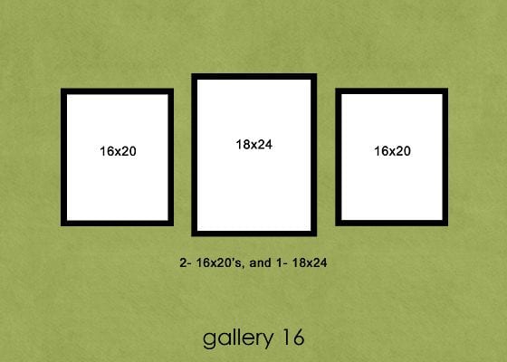
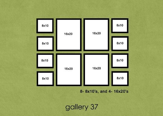
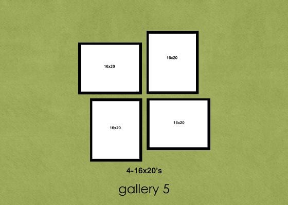
1) Decide on your preferences about symmetry. Making this decision may help you narrow down your choices, making the whole process a little less overwhelming. Do you like symmetry? Do you hate it? While I enjoy a lack of vertical symmetry, a line of symmetry somewhere in a layout is fairly important, but not crucial to my wall displays. Compare this to my mother who thinks non-rectangular, non-symmetrical displays are ten times more cringe-worthy than her 1980s plaid-and-shoulder-padded suit jackets – to the point where she had difficulty being in the room when my dad and I were planning a wall arrangement for their home (don’t worry – it ended up being symmetrical, not to mention HUGE). The bulk of the displays options I’ve been sharing in this series have vertical lines of symmetry (the left half matches the right half), although there are a few that have balance without actual symmetry.
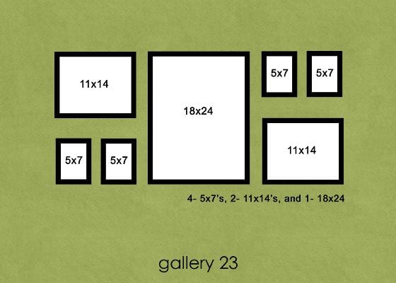
2) Look at your space. Evaluate what you’ve got, and what will help make it look balanced. Don’t know where to start? Consider the size of your wall. A standalone, framed 8×10 on a long empty wall above your couch is not going to balance your space – it’s going to look lost and drastically under-sized. For a situation like this, you’ll want to consider getting one large (20×20 minimum) print to anchor an arrangement with smaller prints on either side or all the way around it. If you’ve got an 8×10 that you really want to frame and use (because a) they often get given as gifts and b) it’s a very popular and affordable photo size), consider putting it on a shorter wall and make plans to add some 5x7s to it pronto.
3) Consider your framing options. Do you like it when photos have bulky frames or over-sized mats? Some people love either of these options, some don’t. What do you think? For large prints, consider matting your prints with 2″ or even 2.5″ neutral colours and using a frame that isn’t going to dominate the viewer’s attention. Smaller prints, like 5x7s, look great with 1.5″ mats.
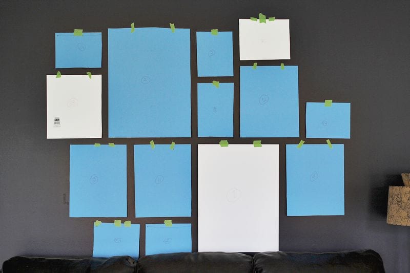
4) Do a mock-up. It’s much easier to tape pieces of paper (measured and cut to size to reflect not only print size but also incorporating mat and frame dimensions) to your wall and then re-evaluate your decision than to have to hammer a bunch of holes in your walls – or, even worse, discover that you’ve gone and bought yourself the wrong sized prints and frames for your space. When doing your mock-up, try to ensure consistent, even spacing between all pieces. Then stand back and assess. You can even leave the papers up for a few days to see if you notice any flaws in your plan.
5) Get hanging! Remember: measure carefully! I’m still working on that last part. :) Or bet yet, read all the way to the bottom for a brilliant little suggestion.
HANGING PHOTOS IN A STAIRWAY
1) Ensure that your photos move upwards at the same angle as your stairs. The line of the images should be parallel to that of the stairs.
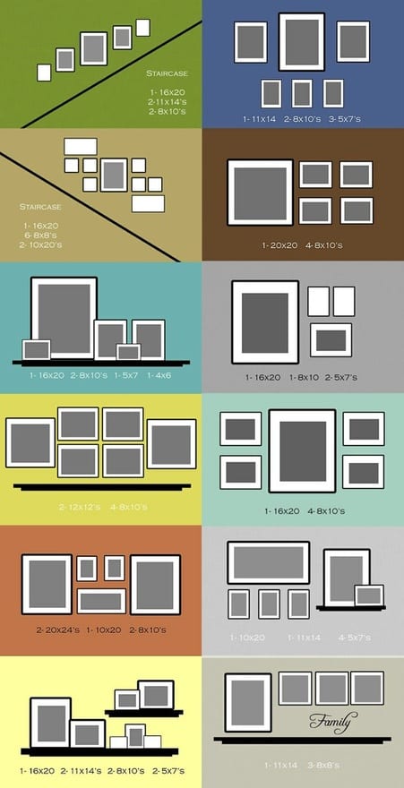
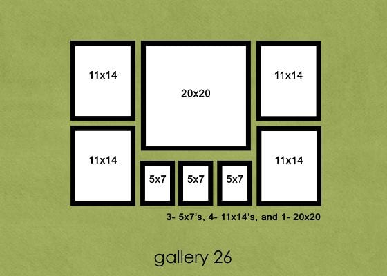
2) Anchor the collection with large focal frames and then accent with smaller frames as in this example:
 There are two examples in the following collection, plus several in my other posts to give you ideas on collections that look great in a stairway.
Here’s a link full of interesting ideas from Kristen Smith on how to style your collection, rather than on how to hang it.
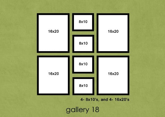
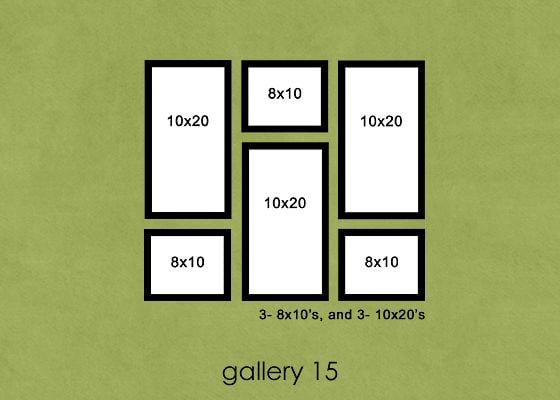
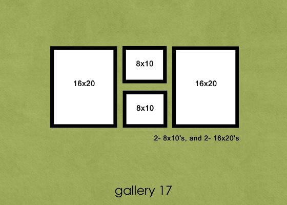
These gallery layouts are from the folks at Cherish:


MOST GENIUS TIP I’VE COME ACROSS FOR KNOWING WHERE TO PUT YOUR NAILS IN THE WALL
Put a little dab of toothpaste on your framing wire/hook. Put your frame in place, without letting it touch the wall. Once you’ve got it lined up, just touch the frame gently against the wall and you’ll have a little toothpaste mark where your nail needs to go. GENIUS! Just don’t forget to wipe the toothpaste off your wall and the frame. :) Now if only that would excuse the number of holes Dad and I have put in the walls over the years…
ONE OTHER IDEA FOR FLEXIBILITY IN YOUR GALLERY DISPLAY:
I’ve completely lost count of the number of people who have commented on/admired/stood transfixed by the sight of the hanging solution I’ve used, so…… Consider copying what my husband and I installed in my studio. (I realise I’m a photographer and should have top class photos, but here’s an iPhone capture anyway:)
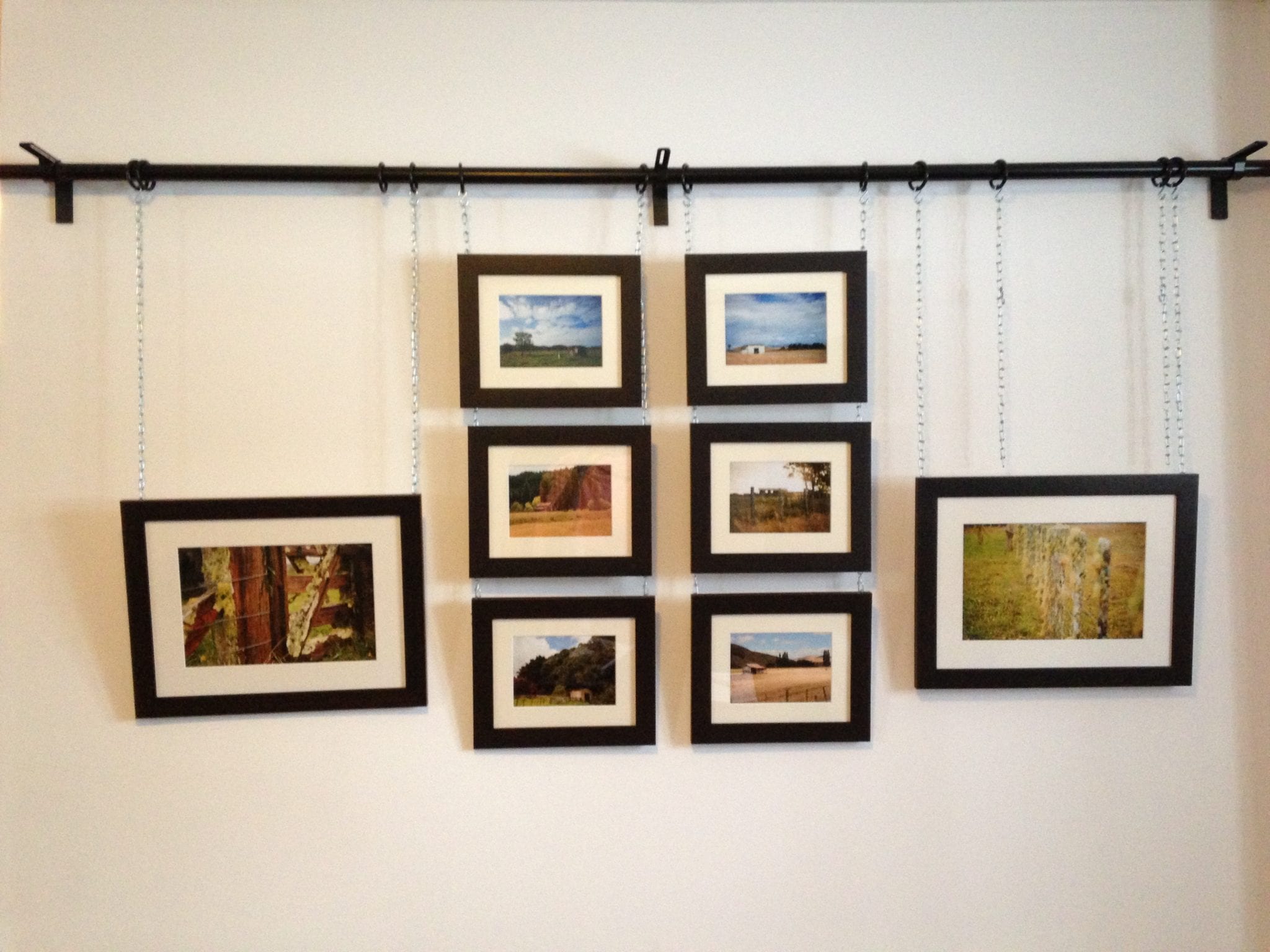
** Little note: this particular display wall also doubles as my curtained doorway, so it’s at maximum curtain length height, not ceiling height)
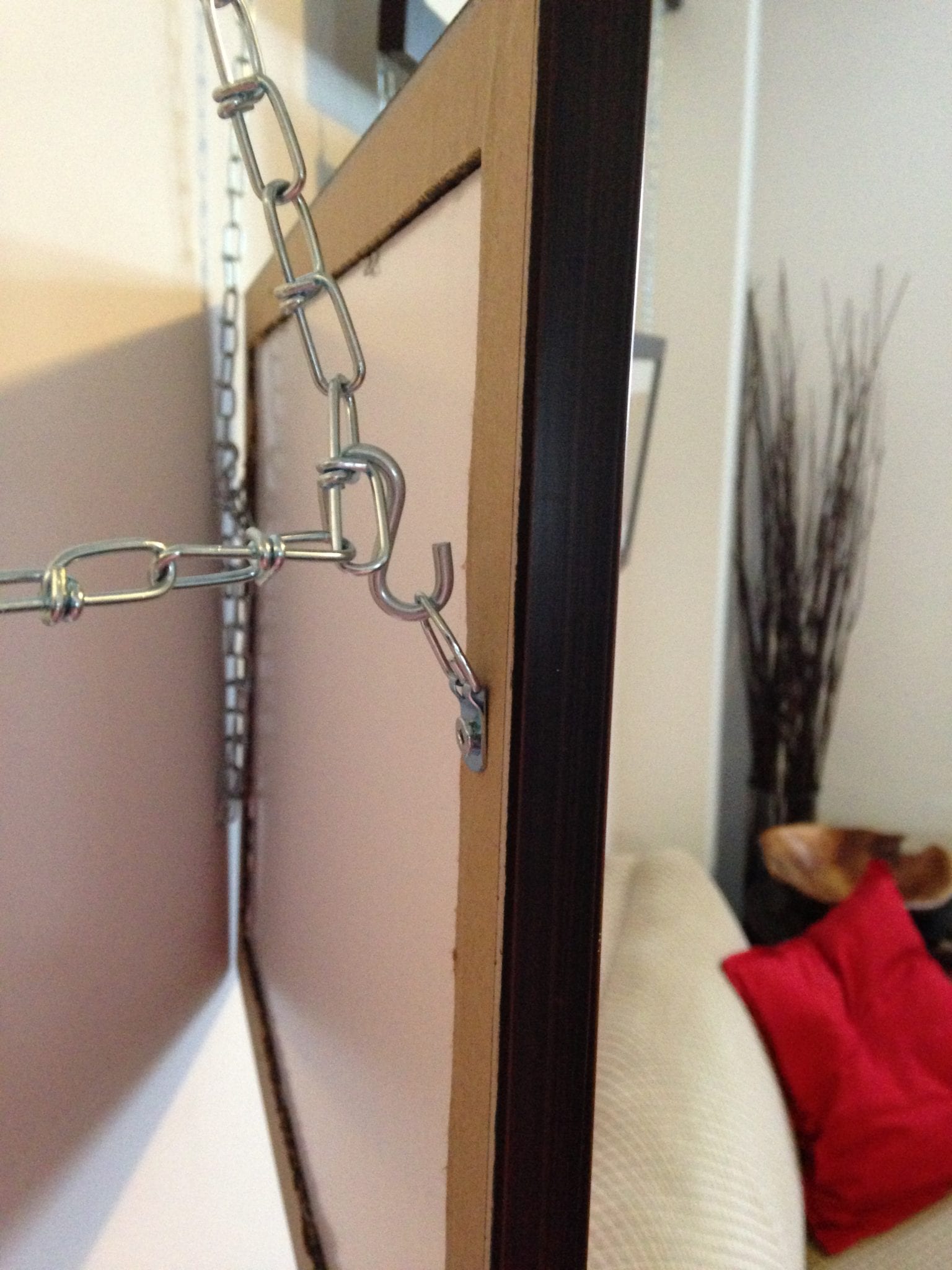
Take a simple IKEA curtain rod and rings. Buy a box of S-hooks and small-loop, lightweight linked chain. Mount your rod at ceiling height and put the curtain rings on the rod. Cut your chain to the longest length you think you’ll ever need (excess chain can be looped up and hidden behind photos). Suspend the chain from the curtain rod rings using one S-hook per chain. Attach one S-hook to a framing hook on each side of the back of each frame:
Attach the frame’s S-hooks to the chain at the desired height and hide any excess chain by looping it back up to the S-hook and latching it on. Other than a serious lack of holes in your wall (except for a few up at ceiling height), the seriously great part about this framing solution is that if you are prone to changing out your frames or changing your mind about displays (consider: getting a new 16×20 in a portrait orientation when your existing gallery contains landscape-oriented images could mess with your design in a major way), then this offers you some serious long-term flexibility. Add, rotate, take away, enlarge… Go nuts! This will support your creativity in the long run.
Phew! Hopefully, somewhere in these three posts, there was something that caught your attention, sparked your imagination, and made you restless and anxious to get moving on your own gallery wall project.
Happy hanging!